Employee_Wages <- function(Total_Estimated_Revenue) {

  ifelse(Total_Estimated_Revenue < 500000, stop("error: no data for this revenue range"),
         percentage <- ifelse(Total_Estimated_Revenue < 999999.99, .0789,
                              ifelse(Total_Estimated_Revenue < 2499999.99, .0934,
                                     ifelse(Total_Estimated_Revenue < 4999999.99, .0751,
                                            ifelse(Total_Estimated_Revenue < 24999999.99, .0975, .1083)))))

  Total_Estimated_Revenue * percentage
}
WINVEST
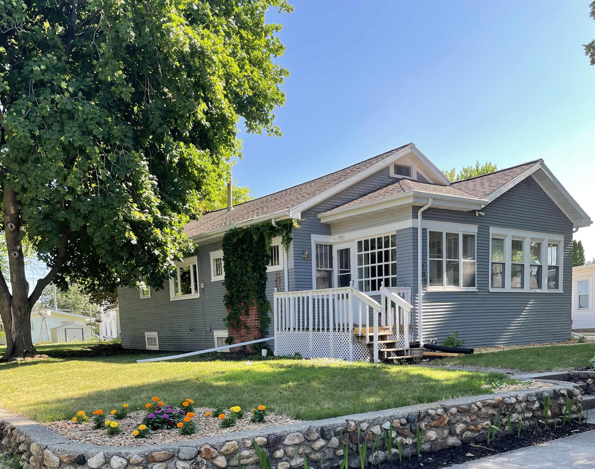
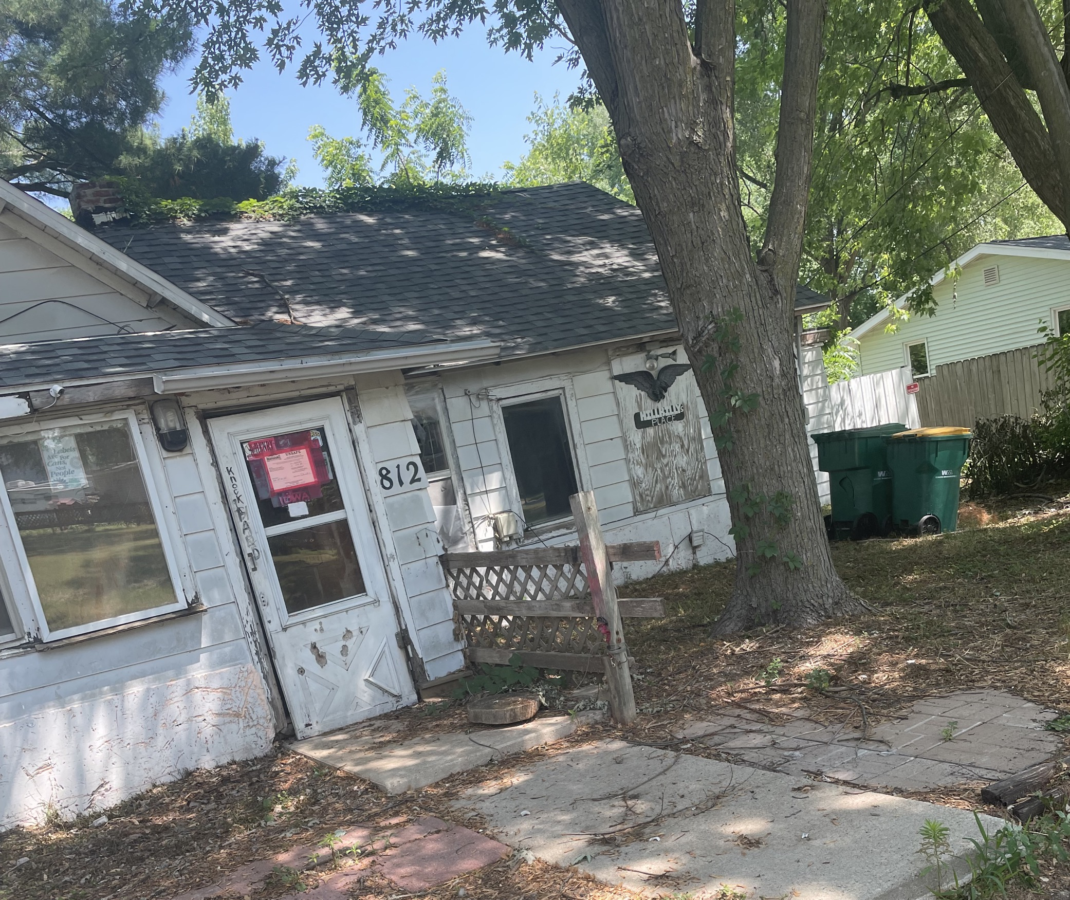
We also spent the first part of the week collecting data for the WINVEST project. On Monday we visited Grundy Center and New Hampton, while on Tuesday we visited Independence, all of which were northeast of Ames. We spent time walking through residential areas taking pictures of houses and filling out forms to be compiled into a dataset that will be analyzed later for the purpose of determining which of the areas will qualify for a grant from the state. We saw many interesting sites and learned a lot of doing field work for data science.
Overview
Currently, our project is in its third phase focusing on integrating the different parts of the project together. The first two phases focused more on designing and reviewing the resources while we are now at the stage of building our application.
Phase One - Investigate the documentation regarding research on rural grocery stores.
Phase Two - Consolidate the literature review and investigate what data helps to automate the process outlined in the Excel tool.
Phase Three - Build the framework for the tool by converting Excel macros into R and documenting these functions.
Testing that functions work modularly
Building a basic R Shiny application
Integrating R functions with the Shiny application
Connecting census data sources to the functions
Market Size
Informative Dashboard Visualizations
Phase Four - Finalize documentation and wrapping up DSPG work.
Grocery Survey: First Impressions
We have also been looking over the results of a survey conducted by Iowa State Extension and Outreach (sponsored by AgMRC) that asked owners and senior managers of independently-owned rural grocery stores throughout Iowa a series of questions about their store’s performance, selection and design, as well as the top challenges they face in keeping their store profitable. The survey divided Iowa into 3 regions and examined the survey results accordingly.
One issue with the survey was the low response rate: only 95 out of 671 independent grocers responded (14.2%). However, the findings might still be useful to look at for our purposes.
There is much more potentially useful information, such as information about the most frequently found unique assets of stores and the specific types of local products most frequently bought according to region, shown here:
Overall, this survey may help us provide useful information to the users of our tool and can help grant us perspective on how well the functionality of our tools maps onto the ground truth of what is really going on with rural grocery stores in Iowa. I found it to be a very interesting and useful resource.
Bizminer Percentages
One important concern for the expenses component of the project is the question of modularity, or the freedom given to the user to affect the calculations performed in the server. The functions used in this project to calculate expenses for potential grocery stores do so by providing different percentages of revenue spent on expenses based off of how high the total estimated revenue input is at the beginning. The original excel sheet establishes 5 distinct ranges that each have different percentages of the revenue across the different line items of the sheet.
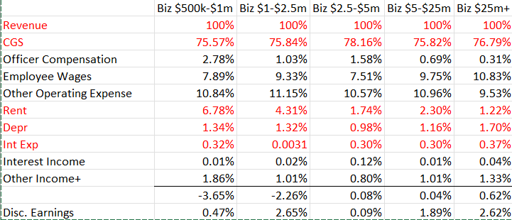
These ranges can be thought of as stand-ins for the different sizes of grocery stores. When a store takes in a certain amount of revenue, the function assigns a budget percentage corresponding to the assumed size of the store.
As it stands now, many of the functions make use of nested “ifelse” statements in order to find the budget percentage of an expense or a source of income and multiply it by the total estimated revenue. For example:
The function gives the user an error message if they enter a revenue amount under $500,000 dollars due to there being no data at that range.
The Linearity Finding
Many of the functions derived from the excel sheet “Estimating Expenses” have been written to take the total estimated revenue as an input and return the dollar amount of a certain cost in accordance to the average percentage of revenue spent on that cost for stores of a similar size. For example, a store that takes in $1,000,000 and a store that takes in $2,000,000 share common percentages for costs such as employee wages and officer compensation. This broad assignment of one percentage based on a large revenue window also applies to the function for calculating gross margin, or the amount of funds left over after accounting for the cost of goods for the store.
However, since most of these functions receive the same input of total estimated revenue and all of the percentages for the expenses are bundled together for the same window of revenue, this creates a problem. Suppose we want to compare the profitability of a store that takes in $1,000,000 of revenue vs. $2,000,000. According to the way our calculations work now, both of these stores will have the same percentage of their revenue deducted as expenses. So if 95% of our revenue goes towards covering expenses for every value that falls within the window of $1,000,000 to $2,500,000, there is a perfect linear relationship between the revenue and the profit of the store; the $1,000,000 store collects $50,000 in profit while the $2,000,000 store collects $100,000. If we were to create a numeric regular sequence of revenue inputs from $1,000,000 to $2,500,000 and plot it against one of our measures of profit (before depreciation etc.), we would get:
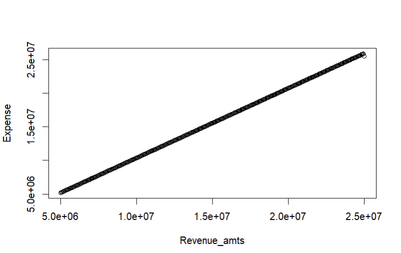
This is a problem because the ultimate goal of our tool is to help potential grocery store owners decide which area could be more profitable for the store that they want to open than the next area. In other words, the model doesn’t afford any insight into the relative advantage of setting up a store in a given a area versus another, because any increased revenue from a chosen area is immediately offset by a corresponding increase in expenses that affects every store within a revenue range uniformly.
A Potential Solution
One way to ameliorate this problem is to simply give more control to the user of the application in choosing their own expense percentages. That way, the user can tinker with the tool in order to determine (in a broad way) how much resources they must have and how they must allocate those resources in order to be profitable in a certain location. We propose that this can be done through R Shiny. R Shiny allows for numeric inputs into functions by means of a user-controlled slider. Through this method, there is no need to discard the default percentages that we were previously working with; rather, instead of being hard-coded into the function, they can be placed as labels along the slider or set as default values that the user can adjust manually if they so choose.
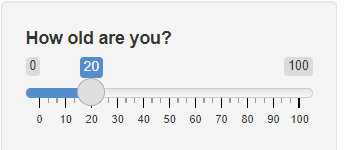
This way, the user can know the industry averages for different variables while also comparing their own plans with those averages.
The Rounding Problem
Another issue I faced was one involving the rounding of percentages of my functions. I had rounded the original percentages up or down depending on whether they were considered a cost or an expense in the balance sheet, and this affected my output significantly when I went to compare my R output to the example provided by Duane (our client) in his excel sheet. Thankfully, when I reverted the percentages to their original state (4 decimal places), my outputs then matched the one’s displayed in the excel sheet. The big takeaway from this is that most of the time, the final output is what should be rounded in a calculation and not the intermediaries. I mistakenly thought that rounding the percentages used in the calculation in certain directions could provide a more “conservative” or “risky” weight to the final prediction. However, since we were dealing with small percentages of very large numbers, the degree of rounding that was there greatly impacted overall accuracy and rendered the predictions illogical. Thankfully, the functions work as they are supposed to now (even thought they may undergo a significant rewrite later).
Automating Location Data
Geocoding/Reverse Geocoding
Alongside working on the expenses functions, I also looked into the problem of obtaining the names of locations within the radius of a point for the purpose of obtaining relevant population information necessary for estimating market size. Two processes are important in helping to accomplish this task: geocoding and reverse geocoding. Geocoding simply means being able to take an address or name of a location and return a set of coordinates fo that location. Reverse geocoding is its opposite: it takes a set of coordinates as input an returns an address in response.
One package that I found to be useful while working on this problem was revgeo. Revgeo is an R package for reverse geocoding that returns the city, state, country and zip code of a set of coordinates provided by the user.
revgeo_address <- function(longitude, latitude) {

  API_KEY <- Sys.getenv("GOOGLE_API_KEY")

  address <- revgeo::revgeo(longitude = longitude, latitude = latitude,
                            provider = 'google', output = "frame",
                            API = API_KEY)

  address
}

address <- revgeo_address(-92,41)addressNULLThis package proved to be useful for making a basic function that gets the list of nearby counties within a radius of a set of coordinates. However, the biggest flaw is that the “county” column isn’t accurate; it lists the name of the country instead. For our purposes, this was a significant roadblock, as having the county of a point makes retrieving data from TidyCensus a lot easier.
One issue we’ve confronted with collecting data from geocoding is how to deal with coordinates near a state boundary. Because of the way that the TidyCensus library collects geography information, getting data for areas outside of state lines is not a straightforward process. Therefore, we have been brainstorming ways to get this interstate data without placing too high of a demand on memory and performance.
Google Maps API
We used the Google Maps API to find the nearest grocery stores. An API is a tool developers provide for other developers that allows them to incorporate their work into other works. The API gives us the latitude and longitude of the other stores, which we can use to find the distance between the stores. We can also use these coordinates to generate polygons.
Quarter Circle
The quarter circle was the original design in the excel spreadsheet. Quarter circles are very simple to implement, and work by finding the radius to the nearest store and turning it into a quarter circle that we are using as the region of our market share. The disadvantage of doing it this way is that it is a massive over estimate because it doesn’t factor the other store’s “sphere of influence” into account. These are essentially a rudimentary version of a Voronoi polygon.

Automating Population Data
We are able to use census information to get data at various different resolutions, such as state, county, tract, and place. Using this we can generate maps and map regions to do different types of analysis. One example is knowing how many people live in a region between two grocery stores.
County: We have census data for the populations of counties, which we can retrieve using TidyCensus. TidyCensus is a package for R which allows developers to easily get Census data.
Town: Using the script Jay made, we can find the populations of all the towns in a given geometry. Jay’s script uses a package called Tigris, which allows us to see demographic data within a geographic boundary. Jay’s script has functions that allow you to give a latitude, longitude, and state, and it will return the city name. You can also give it a county and have it return all the towns in that county.
Rural: We are in the process of automating the rural population. We can calculate this by adding up the populations of all the towns in the county and subtracting that from the total number of people in the county.
Voronoi
Voronoi polygons are a way of breaking up a plane into sections defined by which node of a graph they are closest to. This shows a model where people will go to the closest grocery store purely based on their location. This doesn’t take into account anything about the store, and only cares about the location. The pro’s of this are that in rural settings, people are most likely going to go to the nearest store. The cons of this are that it ignores factors such as offerings, pricing, and the fact that people tend to go towards more densely populated areas to shop.

Voronoi Polygon demonstration from Wikipedia

Voronoi diagram of grocery stores in Iowa
Reilly’s Law
Reilly’s law of retail gravitation is the idea that people are drawn to shop in areas with denser populations. The formula for Reilly’s law is a ratio of distance between cities and the difference in the populations between the two. This is a good model because it takes into account the shopping habits of consumers. The downsides of this model are that it has a lot of limitations, such as the cities having to have relatively similar populations, and it gives an overestimate because it assumes everyone shops locally.

Voronoi vs Reilly’s Law
Voronoi and Reilly’s law can tell us similar, but different things. Voronoi shows the geographic regions where our proposed store would be the closest. Reilly’s law would show the regions around our store that people would be willing to travel in order to shop at the store.
Estimated Revenue Functions
We wanted to start with recreating the functions from Excel into an R package so that we could think about automation and edition later. I worked on the Market Revenue calculations sheet, which was highly dependent on the output from the Market Size Calculations Sheet. So initially, to visualize the flow, I created a flow chart using Miro to map how the functions are linked. I set some default percentages for the share by the primary, secondary, and rare shoppers to the total market revenue, which the user can alter if they want to.

Difficulty in the process
Figuring out the State index and percentage price increase values took a lot of my time after I created the functions. I shortlisted some of the resources that I found can be useful, like the CPI(Consumer Price Index), PPI(Producer Price Index), RPP(Rural Price Parities), and Cost of Living index. What made it more confusing for me was that some of these had values specifically for groceries other than the overall value. After discussing with Duane(our client) in our last meeting, I chose to use the Consumer Price index, which is the measure of the average change over time in the prices paid by urban consumers for a market basket of consumer goods and services, as the estimated price increase, and use Rural Price Parities, which measure the differences in price levels across states and metropolitan areas for a given year and are expressed as a percentage of the overall national price level, as the State Index.
Update and Maintenance
I created the following table to Track the source and links about the variables used and how frequently it is required to be updated.
| Variable name | Frequency | Source | Link | Notes |
| Total US Grocery Sales | Optional | IBIS | Default base year taken as 2022 | |
| Total US population | Optional | US Census Bureau | Default base year taken as 2022 | |
| Estimated cumulative price increase(CPI) | yearly update/ Half yearly update | US Bureau of labor statistics | https://data.bls.gov/timeseries/CUUR0000SA0 | CPI in current year - CPI in base year For now defaulting as 7 for 2023 |
| State Index | yearly update | BEA | https://tinyurl.com/ycwpjzwz | Depends on state |
The consumer Price index is updated every month, but it is fine to take yearly once or twice because it does not change each month very much. And for the Rural Price parities, the latest data that we have is 2021 because it is economic census data and is not available for the recent 1 year.
Comparing Data Sources
After finishing the recreation of the function in R, I started working on making some visualization to display in the dashboard of the tool. I used Plotly to make the visualizations. Plotly offers versatile licensing options, including an open-source version (GPLv3) and a commercial edition. It excels in creating interactive visualizations and enables collaboration, making it a flexible and powerful choice for data visualization needs.
Sales Genie Data Set Vs Google API data set
I was working with the Sales Genie Data sets about the grocery stores and dollar stores in Iowa. I also looked at the Google API data set for the dollar store data in Iowa and Illinos. Most of the visualizations that I created were using the sales Genie Data Sets. Although one problem that I noticed was that it could possibly be missing some stores. I noticed this when I was trying to plot the number of stores in each Dollar Store chain using both the Google API data set and the Sales Genie Data set.

The above plot shows the number of cities in Iowa with more than 1 dollar store plotted using the Sales Genie Data Set. We notice that Ames is not there, although there are 2 dollar stores in Ames.
When I saw the Google API data set to check this, it was also incorrect, saying there are 4 dollar stores in Ames. When I looked at the data table, I found that it had a store which was near Ames, which had the mailing city as Ames. I have more difficulty with the Google data set is that it is not cleaned it has some dollar generals as DG market and differentiated based on name than on chain like shown in the below plot:

The following plots show the distribution of stores in cities of Iowa with more than one chain grocery store and non-chain grocery store, respectively. I am currently working on improving this plot by trying to make a single plot that contains the distribution of the stores color-coded by the type so that we can see if there are any trends that we can observe about the presence of one type of store affecting the other(like if dollar stores affect the non-chain grocery stores).


From all these plots, one common thing that we can observe is that irrespective of the type, there are usually more stores in big cities than in small cities, as we would expect.
Sales Volume Distribution
library(ggplot2)
sales_chain_grocery <- ggplot(data = chain_grocery_store_data,
                              aes(x = Location_Sales_Volume_Range,
                                  fill = Company_Name)) +
            geom_bar(position = "stack") +
  ggtitle("Location Sales Volume distribution for Chain Grocery Stores") +
  xlab("Sales Volume Range") +
  ylab("Number of Stores") +
  theme(axis.text.x = element_text(angle = 90, hjust = 1))
ggplotly(sales_chain_grocery)
The above plot shows the distribution of the number of stores by Sales volumes for the major chain grocery stores in Iowa. I must do data cleaning and arrange the x-axis titles in ascending order to make them more interpretable.

The plot shows the location sales volume for the non-chain grocery stores. We can see that many of the non-chain grocery stores have a 1-2.5 Million sales volume.
RUCC
The 2013 Rural-Urban Continuum Codes form a classification scheme that distinguishes metropolitan counties by the population size of their metro area and non metropolitan counties by the degree of urbanization and adjacency to a metro area.
Each county in the U.S. is assigned one of the nine codes listed below. Codes 4-9 are typically considered to be rural.
RUCC 1: Counties in metro areas of 1 million population or more
RUCC 2: Counties in metro areas of 250,000 to 1 million population
RUCC 3: Counties in metro areas of fewer than 250,000 population
RUCC 4: Population of 20,000 or more, adjacent to a metro area
RUCC 5: Population of 20,000 or more, not adjacent to a metro area
RUCC 6: Population of 2,500 to 19,999, adjacent to a metro area
RUCC 7: Population of 2,500 to 19,999, not adjacent to a metro area
RUCC 8: Less than 2,500 population, adjacent to a metro area
RUCC 9: Less than 2,500 urban population, not adjacent to a metro area
Matching the city names in the Sales Genie Data Set to their counties will help us make a plot classifying the stores based on their location according to the RUCC (Rural-Urban Continuum Codes). This could help us visualize if there is any correlation between the number of a particular type of store and urban or rural counties